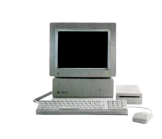
The Perfect GS/OS Desktop Picture or How to Get the Most of the 640 x 200 Super Hi-res mode
Let's face facts: the 640 x 200 pixel super hi-res graphics mode is as Woz-like ingenious as it is frustrating.
It was cleverly introduced to the inner workings of the IIGS to provide a higher resolution than 320 x 200, allowing more detail and screen real estate into applications that followed Apple's GUI guidelines with no additional overhead. According to the 'Apple IIGS Book,' providing a resolution of 640 x 200 instead of 640 x 400 ensured that the accompanying RGB monitor available with the IIGS could be made cheaper instead of the more expensive monitors used by the Atari ST and Amiga; although Apple's solution ended up being more expensive than both those alternatives when shipped!
Together with the limitation of only being able to use 6 colours in 640 mode (which HAVE to be dithered to 16) or 4 colours to maintain the original colours with the use of dithering, it meant the IIGS need only ship with 32k of VRAM in its VGC chip. The dithered colours almost appear completely flat thanks to the dot pitch of the Apple Color RGB monitor, which was better suited to displaying 320 x 200 pixels.
But, this means compromise. Much like the original hi-res graphics mode of the very first Apple II, it allowed a higher resolution, but the price was a lack of control over how the colours could be used, which is dependent on what vertical column of pixels you're hoping to use for a specific colour.
Essentially, what this means is if you're using the standard dithered colour palette in 640 mode is that you can't even use the original 6 colours in addition to the dithered 16 colour palette (the exception being the two colours sitting at the beginning and end of the palette, usually reserved for black and white) unless you intend to use 1 pixel width because the colour can only be used on alternating vertical columns of pixels: hence the mandatory dithering. Below is an image that shows both the original 6 colours dithered into the larger 16 colour palette:
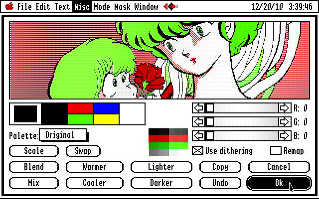
While dithering does extend the number of colours available, they're not the best: hardly vibrant, they look either muddy or washed out. Of course, having more colours available can have many practical uses (labelling files with a colour in the Finder, for example) but doesn't always allow for the most aesthetically pleasing palette, but we're stuck with it.
In the broader world of computing, desktop pictures are hot. You can easily recognise a Mac from a PC simply from the desktop picture...and Apple and Microsoft don't just choose any old picture, they're either beautiful photos or illustrations with amazing tonal and colour ranges that truly show off the capabilities of whatever display is hooked up to the computer or built-in to a mobile or tablet device, but at the same time, don't overpower what else is on screen, i.e. the operating system and applications.
It's time the IIGS had some decent 640 x 200 standard colour palette mode graphics for its desktop, replacing the boring default periwinkle blue with the freeware desk accessory 'DeskMaker' by Rolf Braun.
Pixel art takes a lot of dedication and patience, neither of which I can cultivate at this point in my life and so I first turned to the graphic stylings of my more newer retro computing interest, the PC88. The PC88 also shares the same 640 x 200 resolution as the IIGS, however, the 8 colours it can display at once are not constricted to any vertical rows of pixels - colours can be used solid, or dithered (on alternating vertical columns of pixels AND horizontal rows).
8 colours might not sound like a lot, but the Japanese are truly masters of the visual medium and know how to fully exploit design limitations without losing an image's impact. Turning to methods more commonly used in limited colour print runs, a lot of PC88 artists used very extended palettes using varying dithering combinations to create the illusion of more colours. The more spread out two colours are combined, the greater the likelihood that they too can be displayed on the IIGS without any modification.
Results can vary as to how well some images convert, but the most important thing on the IIGS is using the right tool to bring these PC88 images across: Super Convert 4. While every other graphics conversion program for the IIGS treats the 640 mode like the 320 mode with the 640 mode palette, Super Convert truly respects all the pixels found in the original image and will convert them as best it can across the available 640 pixels across the highest horizontal resolution of the IIGS.
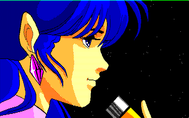
And so I scoured many PC88 slideshows, paint programs and games via emulation (using Quasi88, which I had to compile myself on my PowerMac G5 and separately again for my Intel based MacBook Pro with some help from the Emulation MacScene forum) taking screen shots of images with the best detail and composition. I was hoping to come across a lot of cool images of mecha from my favourite anime, Macross, but only found the one (from a paint program called Da Vinci). Here's the original PC88 image:
Conversion using Super Convert 4 yielded this first unfortunate result:
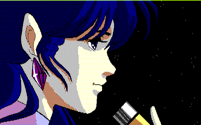
However, all is not lost. The image just happens to be using colours that aren't in the right vertical column of pixels in the 640 mode palette. Photoshop has become an invaluable tool as an intermediary when converting images to the IIGS and is especially useful in this case. To improve the conversion I simply select Minmay's face and microphone and shift them one pixel across to the left. It's true I'm losing a column worth of pixel detail, but this is negligible when you consider the new result:
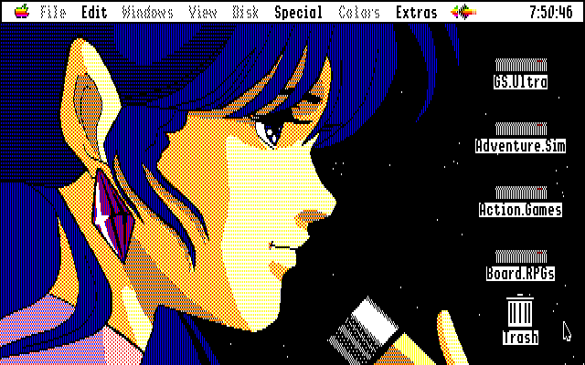
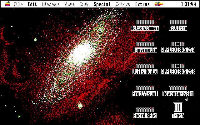
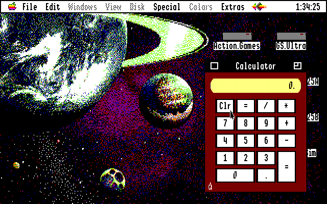
I made similar changes to other images but in a lot of cases, I got lucky and the colours aligned to the vertical columns of the 640 mode palette. Here are some additional examples with which you can compete against OS X Leopard and Snow Leopard desktops with your IIGS (from the PC88 games Schwarzschild 1 & 2):
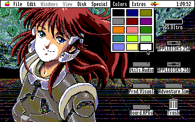
Two more of my favourite converted images:
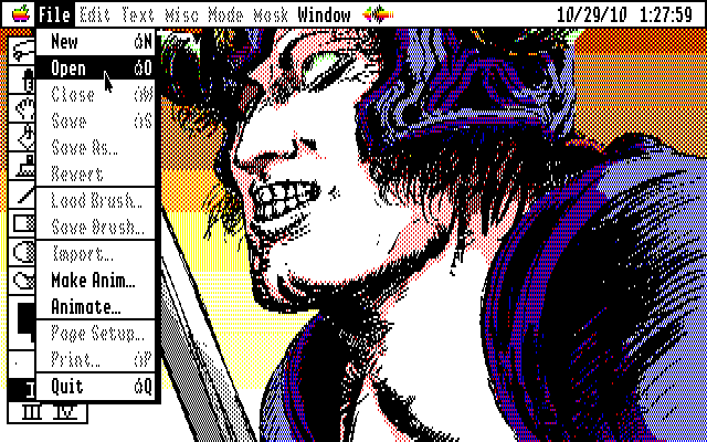
My other approach for converting existing imagery to great looking IIGS desktops was this: find pixel art with 2 to 4 colours. It's pointless trying to convert 32 colour images and expect them to look good in the 640 mode: don't even try.
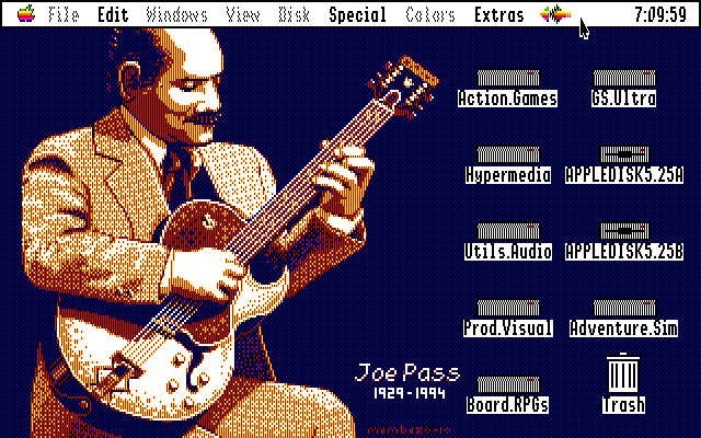
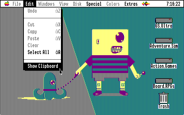
I rummaged through Pixel Joint using a customised search specifying a listing of images as large or larger than 200 by 200 pixels and using less than 8 colours. There are many great images using these limitations, as quite often Pixel Joint will host competitions that truly test the metal of its artists by asking them to complete illustrations with restrictions on colour, theme and resolution.
I may edit images in Photoshop slightly to improve the composition for the IIGS desktop (always leave more blank space on the right hand side of the screen to allow the disk icons to be seen easily) but here are some results:
![]() Ultimate Apple IIGS Desktops (1meg)
Ultimate Apple IIGS Desktops (1meg)
So...hot or not? I can't help feeling that the IIGS would have majorly benefitted from 64k of VRAM, allowing PC88 style 640 x 200 mode images and 32 colours per scanline 320 x 200 graphics akin to the Amiga, but I hope you like these images and that they bring that little something extra to your IIGS experience while you muck around doing more productive things with our sweet 16.
