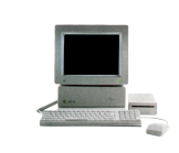
Professional Desktop Publishing and the Apple II
Growing up, I loved Apple II magazines A+, InCider, Nibble and the Apple IIGS Buyers Guide.
They were all very well produced, intensely professional publications. They mirrored the high visual standard set by Apple with fantastic product photography, terrific typography and clever copy. I was excited to come across any new issue of the aforementioned magazines - they weren't always easy to come by in my relatively small hometown of Newcastle, Australia.
In more recent years, now that I'm a practising graphic designer for both print and digital formats, I still marvel at these magazines; how on earth did they produce these elegant publications without the use of digital technology?

Roger Goode, quite out of the blue, has answered some of these questions for me when he recently wrote into ‘What is the Apple IIGS?'. Roger worked at IDG, the company that published InCider (and later, InCider/A+); I'll let him explain the rest:
"I got my start in publishing by being hired on AmigaWorld magazine (also published by the group that did InCider). I was hired mostly to create graphics with the Amiga for the magazine. But that alone wouldn't justify my hire. So they also made me a designer. In both cases--using the computer to create graphics, and doing magazine design--I was a complete novice. My background was fine art (oil painting). But this company was an outlier of IDG, based in Massachusetts, and they hired a lot of people with marginal skills and just let 'em learn. It was a great environment."
I'd visited Roger's self promotion web site and went immediately to his portfolio and his resume. When I came upon his summary of his time working on InCider, I was in awe. Roger had led them them from traditional paste-ups to the new digital age!
For me, I'd never designed before the Mac, Adobe and Quark came along. So I asked Roger: how the hell did you layout magazines before that?
"...I learned to do magazine design--old school--just a few years before the advent of desktop publishing. Basically the process was all paste-up and mechanical... Meaning that we had boards--pre-formatted paper sheets for a magazine spread--with pale blue grids on them.
Then we would decide on the column count for an article and order the (final edited) copy from the typesetting department. They would send us paper galleys of the copy, set at the right width, and then we'd run it through a waxing machine which applied a thin coat of wax to the back of the paper.
With X-acto knives and T-squares, we would then cut up the galleys, and combined with waxed photocopies of whatever artwork was going on the page, we'd carefully paste down the copy and art to layout the page. Sometimes edits would need to be made, or other adjustments, and we'd have to laboriously cut up the copy--sometimes line-by-line--and move it around to copyfit. If it got too badly sliced and diced, we'd order new galleys and re-paste it based on the last version we'd have on the board.
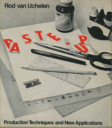
The old school way.
When everything was finally in place and approved, we'd send the finished board back to typesetting to generate new galleys in finished form in better "resolution" on better paper. All of this was in black and white, so finally we'd have to put a tracing-paper overlay on top of the board and mark that up with handwritten notes to indicate where there was color, and other printing notes. That is what would be sent to be transferred photographically to plates for printing. It's hard to imagine how laborious and time-consuming all that was in retrospect."
Knowing full well myself that it takes some persuading just to change one from one digital workflow to another, never mind analogue to digital, how did the step up to a digital workflow go?
"When the company was first considering moving to desktop publishing on a Mac, the decision was made that InCider would be the first magazine in the group to take the plunge. The Art Director at the time was going to be going on maternity leave, and was also nervous about having to learn to use the new technology. So they started searching for a new Art Director to be the guinea pig. Since I had already grown comfortable using a computer on the Amiga, and they weren't finding any takers among the established Art Directors, I got the job... sort of by default.
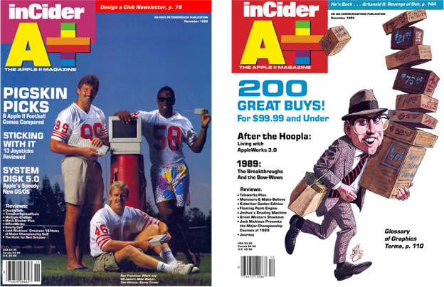
Spot the difference? From cut and paste to digital layout
It was an amazing opportunity. Both to be on the leading edge of a new publishing model, and to leap into the role of Art Director... Something that might have taken years for me to move up to otherwise. So I jumped in with both feet. For the next few months, I practically lived in my new office. One of the goals for the initial rollout of the new model was that it be undetectable... meaning that they didn't want anyone to see any difference between the last issue and the new desktop published one, at least not typographically. So all of the typesetting had to look the same.
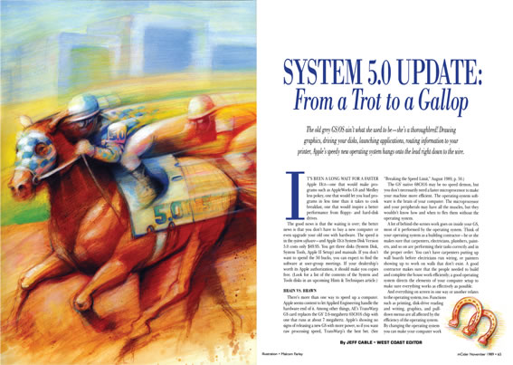
A layout from the Nov 89 issue – the last to use traditional layout techniques.
I had one of the old typesetters in my office constantly--teaching me the ins and outs of setting and matching type. But it was all being done on this new platform, where the software (QuarkXPress) was relatively new and the options were much more limited than they are today. I'd have to say that it was a good thing that I didn't really know what I was getting myself into when I threw my hat in. The process was nightmarish at times and the deadline set by the company was coming up too fast.
But we pulled it off in the end... I don't think anyone really noticed any changes in the printed copies--except for the note in the Editorial that issue. (I can't remember which issue that was now) After that, it continued to be a fairly steep learning curve, but the worst was over and all the rest was actually a lot of fun, learning new tricks and having so much more control of all the elements in the page design. The only sad part is that--over time--a lot of people started losing their jobs, as more and more disciplines started be concentrated into one job of Desktop Publisher. Typesetting, Production, Stat Room, all these different jobs started to fall by the wayside."
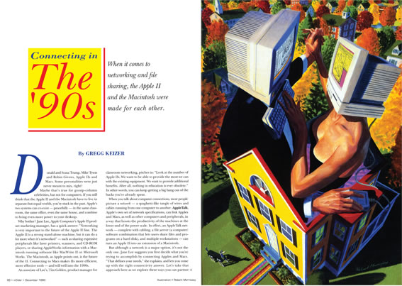
A layout done with Quark Xpress, from InCider/A+ issue Dec 1990
And there you have it - a great account of how it was done in the old days and how quickly all the laborious elements of a job can be rid of almost overnight...as well as the livelihood of working professionals practising traditional methods. We seem to be entering a similarly new phase with this now, with Apple having changed the nature of buying music (and to lesser extents movies and TV) and their new push into education, textbooks and books in general. It's sometimes hard keeping up.
