Set Scanners to Stun! Restoring Printed Material for the Apple II
Hello Apple II and digital restoration fans!
After I first asked around for scans of hardware and publications around July 2007 some of you may have been wondering the last year: what the hell took so long in seeing them on the newly revamped site?
The short answer is this: I take great lengths to ensure that every scan submitted, whether it be a game box, magazine cover or promotional piece is represented as best as possible in high resolution digital form.
Why bother to do this when the images appear in a relatively low resolution on the web site? Well, the impending Apple IIGS coffee table book for one. Print is a very different beast compared to displaying images on a computer monitor. My aim with the book is to produce as high a quality book you’re ever likely to find and to ensure that, the images planned for use need to be of the highest quality. That quality is determined by their resolution, tonal range, colour accuracy and how ‘clean’ the image is from tear marks, scuffs, dust, scratches, finger prints and anything else ‘dirty’ your imagination could conjure.
The beauty of preparing high resolution images in Photoshop, maximising their tonal range, ensuring colours are accurate and applying a lot of cloning and healing brush techniques is that not only will print benefit, the quality of the images on the web site will also gain from each of these techniques. The cleaner the image, the better it will present itself as a lower resolution JPG as JPG compression removes picture information. By maximising best quality to begin with, the removal of picture information won’t be quite as bad when converted to JPG from TIF or PSD formats. Additionally the file size should be improved as well, as with less ‘noise’ the JPG compression will work more efficiently.



These three images show the original scans.



These three 'after' images show the difference in quality after Photoshop retouching.
What comes next is a (more or less) step-by-step approach to how I retouch scanned images in Photoshop.
Last year I bought the mid-range Epson Perfection 4490 Photo flatbed scanner. It can only scan up to just over A4 document size, but to get a model more advanced is in a different price league. It’s proven to be pretty damn good at its job regardless.
Soon after I began scanning each of the magazine covers I owned for A+, InCider, A+/InCider, IIGS Buyers Guide, II Alive and GS+ magazines. Disregarding GS+ (which is a 2 colour production for which I used very different methods of restoration, best left for a future blog) the rest of the magazines are, except for the later II Alive newsletters, full colour. Each of the magazines is wiped with a microfibre cloth to remove anything on the surface that would otherwise scan with the image. Prevention is part of the cure.
I set my scanner to scan at 300 dpi, 100% of its original size at 48 bit colour, resulting in a 16 bits per channel image. This includes extra tonal information that should help in producing a better result for the final restored image. Additionally, I don’t allow the scanner to automatically improve tone or colour – this I do manually in Photoshop.
At this stage of preparing a scan it is very important to set de-screening for which I de-screen for 133lpi (traditionally a common half tone screen resolution used for magazines). What this does is compensate for the rosette pattern inherent in any offset printed material, which subtly blurs the image. The rosette pattern creates the illusion of full colour, which works when seen from a normal reading distance. In reality, ‘full colour’ is only made up of cyan, magenta, yellow and black (CMYK) each of which are angled at different degrees to each other and in combination with a half tone screen, create the rosette pattern. While this trick works on the human eye it doesn’t work on the scanner and computer that record exactly what’s shown. You want to be able to remove as much of the original rosette pattern as possible because if you’re planning on printing the image again, you don’t want TWO rosette patterns to appear, which destroys the illusion of continuous colour.
I’ve probably now lost half of the reading audience by this point, which is a shame because there’s a lot less technobable when it comes to actually restoring an image.
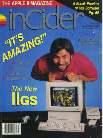
The image we’re going to retouch is the issue of InCider that introduced the IIGS, with the occasion being made by your favourite geek and mine, Steve Wozniak.
First of all, I like to make sure my scan is straight, that each of the corners of the cover should be 90º angles. Despite best efforts to position the magazine as straight as possible on the glass of the flatbed scanner, it seems ‘straight’ scans are never guaranteed. I found out from scanning all these magazines that the trim of many of them was wildly inaccurate, therefore the original magazine itself doesn’t actually have 90º corners! So we’re going to give them the perfect corners they always deserved. You can also use the ‘Perspective’ feature of the crop tool to compensate for this issue.
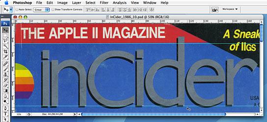
Firstly, I find a reference on part of the cover image for something I know should be perpendicular to the top and bottom trimmed edges. In this instance, I’ve picked the baseline of the InCider masthead and the bottom of the red tagline border. With the rule displayed I drag one guideline to the bottom left of the red border and another to the bottom left of the masthead. You can see that the image is angling away from the bottom left of each of the guidelines.
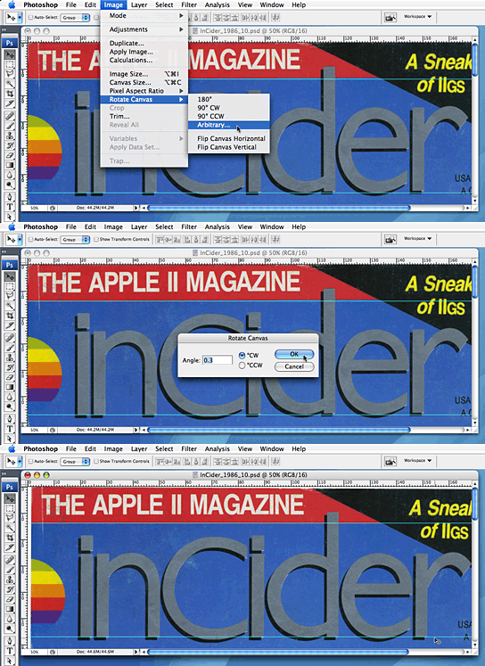
I then rotate the canvas using the ‘Arbitary’ method and try a couple of values to see what best lines up the red border and masthead to the guidelines. It was only 0.3º that made it all the better. That may have then created an issue with the top edge, where you can see it now trails down, but because those areas are flat colours, they are easy to repair.
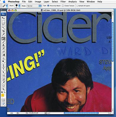
You can see from this image that my copy of the magazine is covered in scuff and dust marks. Also, the previous owner decided to write his name in ballpoint pen across the front cover.
I use the heal brush, a relatively new tool in Photoshop, to remove each of the undesirable spots. The heal brush works by looking at the surrounding area outside of your brush and then painting inside the size of the brush what the surrounding area looks like. If there’s too much ‘dirt’ in the surrounding area, the heal brush will paint that, so when this occurs, I rely on the tried and tested method of the cloning brush, where you can source any area of the image and paint with that.
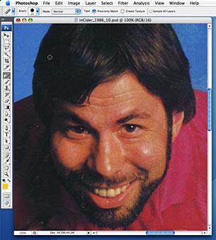

The Woz has various points of dirt all over his face and out of respect for the man, I used the heal brush to remove all of it.
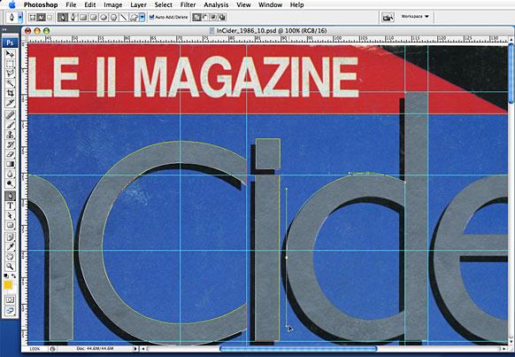
Back to the InCider masthead. Because this is another important feature of the cover, I’m going to make an effort getting it right. I end up tracing the masthead using the pen tool resulting in bezier paths outlining the original masthead. This is the most accurate way to make a selection in Photoshop, but requires a bit of time when compared to the magic wand tool. I figure it’s worth the effort because this masthead appears another 30 odd times before it’s updated for the June 1989 issue, so this bezier path outline can be reused for those future issues.
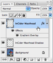
The path can then be converted to a selection, which I then create a new layer for and fill it with any colour. Because the masthead (and the bullet listed articles below) is actually using a fifth metallic ink (no doubt an extra expense to highlight the gravity of the launch of the IIGS), we want to simulate that metallic look without resorting to using a metallic ink (which is impossible for a web image, and not practical cost wise for inclusion in the book). To do this, I’ve added a gradient layer style. The beauty of employing a layer style is that you can continue to tweak its appearance long after you first applied it; it remains live. The custom gradient I create includes several different tones of grey.
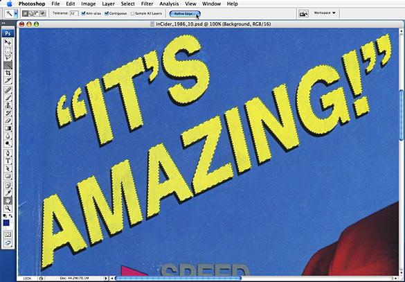
For areas I know are flat colour only, I make selections of them using the magic wand. I use the ‘Refine Selection’ option in Photoshop CS3 to smooth over the edges and contract the selection a little from its edge, which helps blend the existing colour to the 100% flat colour about to be added on a separate layer. Using the eye dropper and set to 5 x 5 sample size (to obtain an average of the colour in the surrounding area) I then fill the selection with that colour. Doing this removes any scuff marks in one fell swoop. I apply this method to all areas of flat colour.
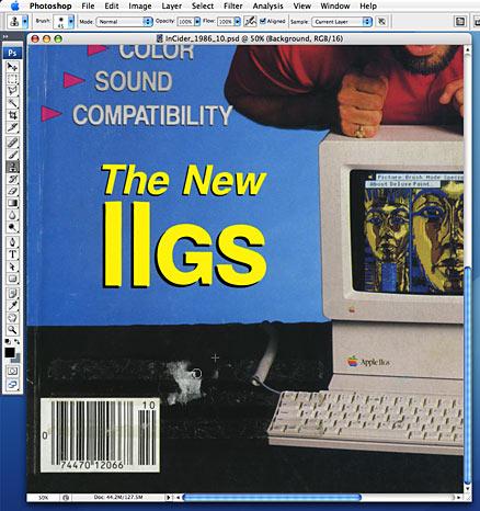
Before scanning I tried as carefully as I could to remove the subscription sticker. After it had been there for 21 years, it wasn’t going to go without leaving something of itself stuck to the cover. So that had to be cloned out with the surrounding area. Note the wonderful, solid flat colour of the ‘The New IIGS’ type above it.
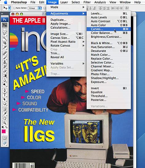
With as much of the ‘dirt’ removed either using the healing or cloning brush, it’s time to move on to one of my favourite bits: using ‘Curves’ to improve the tonal range of the image.
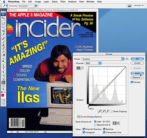
When hitting ‘Auto’ in curves what Photoshop does is find the lightest point of the layer you’re currently on (the main scanned image at this point) and makes it white (we’re talking Red = 255, Blue = 255 and Green = 255). At the same time, it finds the darkest point in the image and makes it black (R=0, B=0, G=0) and evenly stretches the tonal range of the image to fit in between white and black. This will almost always improve the image immediately. I like to bump up the midtones just a little after applying auto curves, just to make that image a little lighter (because when the image is ultimately destined for print, it’s not going to appear as bright as it does on a monitor).
Another technique I like to use to improve colour is ‘Selective Colour’. From either the nature of the old printed material itself (going yellow usually), or from the muddyness that dust introduces, or the lack of ability of the scanner, ‘Selective Colour’ can boost the colours closer to their original intention.
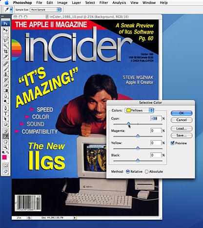
For example, if I want to boost yellow within the image, I’d select ‘Yellows’ as the group of colours I want to manipulate. Rather than adding more yellow, I go to its polar opposite, ‘Cyan’ and DECREASE its percentage value. What this usually results in is a stronger less muddied yellow. It’s especially useful when selecting ‘Whites’ as the colour and reducing the ‘Yellows’ for scanned material that’s aged so badly the white paper has started to become yellow.
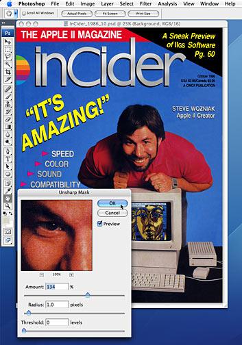
We’re nearly there. I like to leave this step last after having cleaned up the pixels in our image, improving the tone and boosting the colour. We want to sharpen the image. But of course, after years of using Photoshop, we all know the ‘Sharpen’ filter is highly frowned upon. Instead, we use the ‘Unsharp Mask’ filter. Trust me. I almost always use a radius of 1.0 pixel as anything more the image becomes unnaturally blurry, with 0% threshold. The amount…well, you can use your eye on that. I usually use between 100% and 150% (if your image is at 300dpi) and Photoshop will update your image almost instantly, previewing the effect. Too high an amount and you’ll end up with an unusual halo effect.
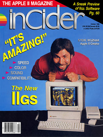
But the unsharp mask ends up looking perfect and completes restoration of the magazine cover, just as it appeared in your hot little hands, as you probably waited for it to arrive listening to Cyndi Lauper’s ‘True Colors’, during those halcyon days of October 1986.
So I lied: there was no real short answer. But that’s what’s been involved in restoring, at last count, 30 A+ magazine covers, 8 IIGS Buyer’s Guide covers, 30 InCider covers, 46 InCider/A+ covers and 12 II Alive covers.
Next Time: Using 2 x 1-bit 1200 dpi scans of each colour plate for GS+ magazine cover, adding both plates in InDesign and then exporting them as PDFs.
